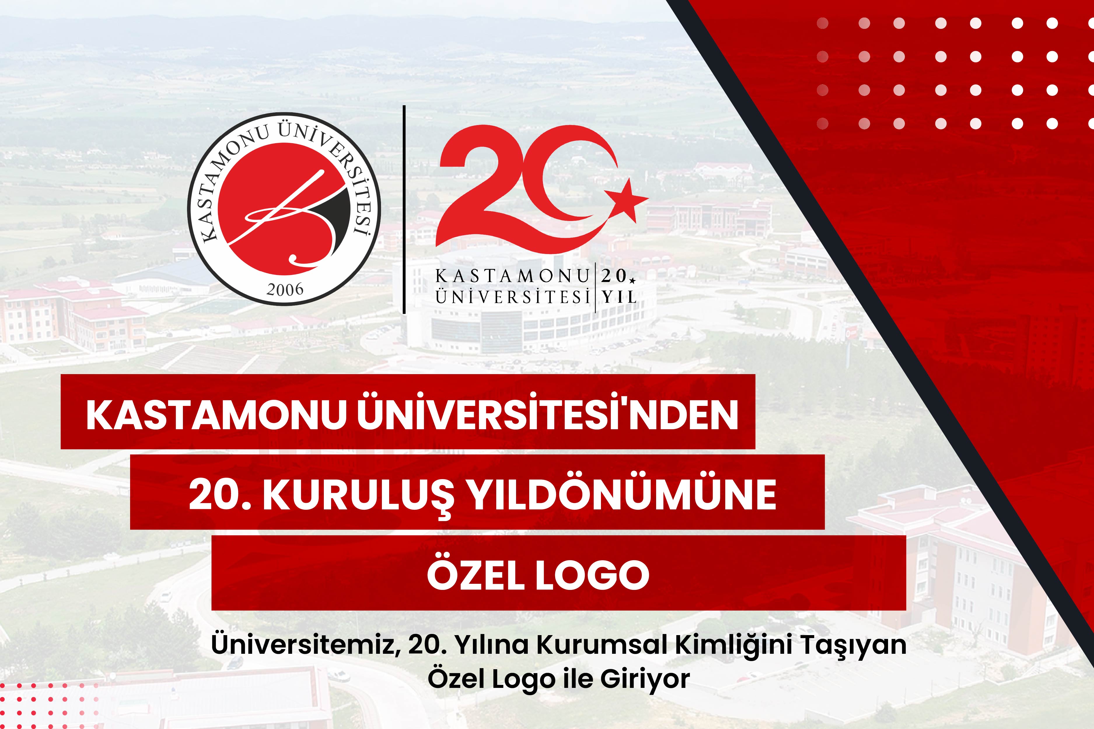
Kastamonu University, which has followed a steady development path in education, science, culture, art, and sports since its establishment, shared its special logo, prepared for the 20th anniversary, which it will celebrate in 2026, with the public.
The 20th-anniversary logo, which symbolizes our university's academic journey, brings together institutional knowledge and a forward-looking vision in a visual narrative. The design, with its structure and symbolic expression aligned with our University's corporate identity, will serve as the common visual language for all activities throughout our 20th anniversary year.
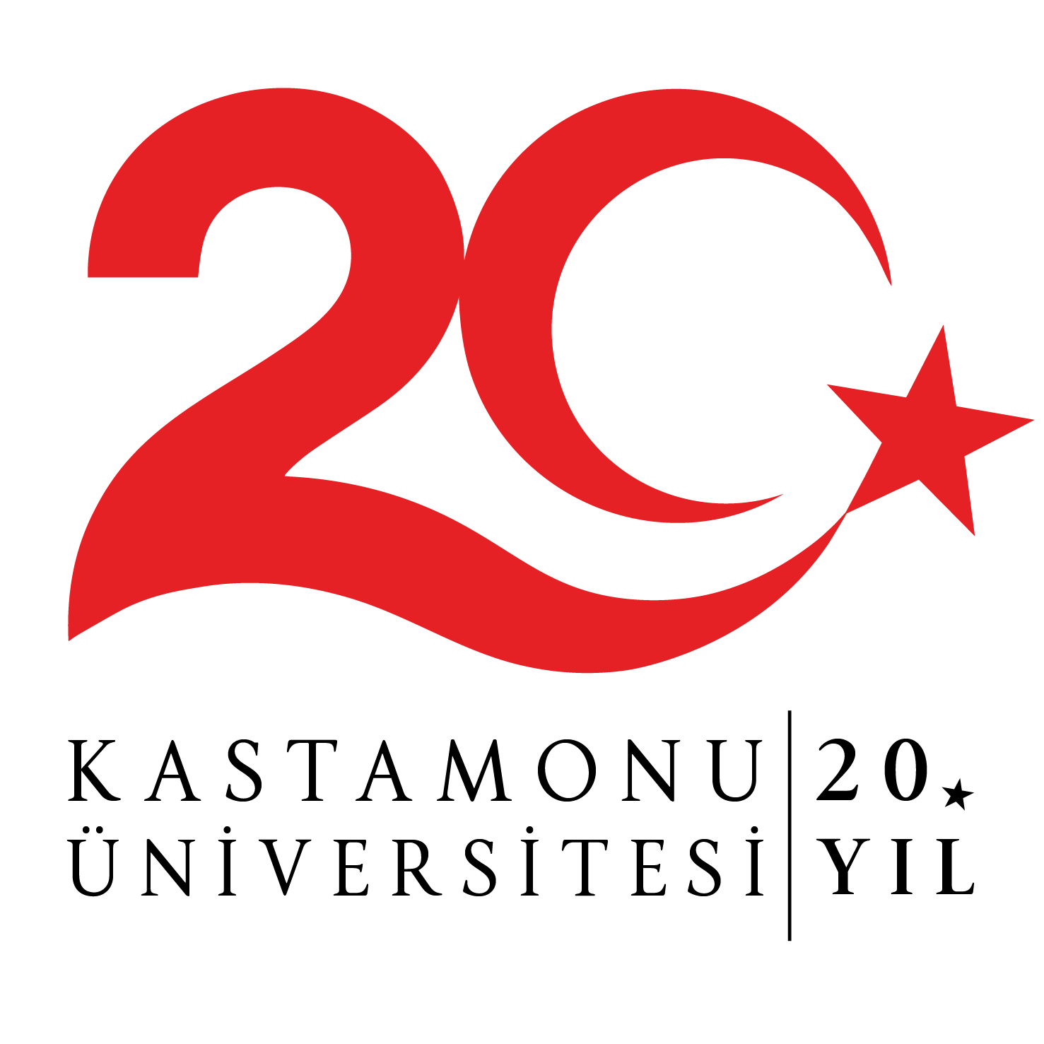
The logo design process, prepared by Assoc. Prof. Dr. İsmail Helvacı, in the Department of Fine Arts Education, Painting-Work Education at the Faculty of Education, was inspired by the concept of "wahdet" (unity) as formulated by Mehmet Akif Ersoy, a valuable figure in the Turkish intellectual and literary world. This thot of Mehmet Akif Ersoy, who also spent a period in Kastamonu during the National Wars years, represents our university community, which is moving forward together toward common goals.
The fluid lines and rising graphic structure in the logo are among the fundamental design elements that support the academic and institutional development of our University. The number "20" represents the knowledge, experience, and institutional memory accumulated by our University over time. The fluid and integrated form emphasizes continuity and movement. The part of the number that forms a crescent symbolizes the crescent, the sacred symbol of the Turkish flag, while the star at the open end of the crescent represents the young people who will grow up on these lands.
The curved lines used in the design offer a multi-layered visual narrative that symbolizes Ilgaz Mountain and the historical and natural riches of our province, especially the Independence Road. While the color red reflects our university's research and learning-focused academic vision, the rising form represents a stable development approach with its national and international visibility. Therefore, with its slightly rising slope from left to right, the logo visually supports academic progress and sustainable growth.
Our university's 20th anniversary is not just a celebration; it is also considered a process of accounting for the past and setting goals for the future. Our university, built upon the deep-rooted educational tradition that began with the establishment of the Kastamonu Darülmuallimin, continues this tradition through its national and international achievements and the social projects it undertakes.
Official Logo Accepted: Evaluation from Our Rector, Prof. Dr. Ahmet Hamdi Topal
The 20th-anniversary logo of Kastamonu University was adopted and put into effect by the University Senate. Therefore, the logo was chosen as the common visual identity element to be used in science, culture, art, society, and sports events to be held throughout the year; in print and digital publications, official correspondence, promotional materials, the corporate website, and social media accounts.
Stating that the activities planned for the 20th anniversary will provide a common meeting ground for our university community, our alumni, our city, and all our stakeholders, our Rector thanked all our academic and administrative staff who contributed to the preparation, especially the design process for the 20th-anniversary logo.